






























































How to Design a Challenge Coin: From Concept to Final Proof

Key Takeaways
- ‣ Start with purpose and story before you touch any artwork, it controls every design decision that follows.
- ‣ Assign a clear role to the obverse and reverse so your coin reads as a sequence, not a cluttered collage.
- ‣ Finish, edge style, and relief depth change how a coin feels just as much as the artwork itself.
- ‣ A clean vector file and specific revision notes are the fastest path to proof approval without surprises.
Ready to turn your concept into a coin? Get a free quote from The Monterey Company, and see your design in metal before you commit.
Start With Purpose Before You Start With Art
The most important question in challenge coin design is not “what should it look like”, it’s “what does it need to do.” A coin made for unit recognition has a completely different design job than one built for employee appreciation, first responder awards, fundraising, or commemorative events. Purpose controls everything: the information hierarchy, the artwork tone, the finish, and even the size.
Write a one-sentence story statement before sketching anything. “Honor the graduating academy class” or “mark ten years of service” gives you a standard to judge every revision against. Without it, feedback loops get vague and painful fast.
Define your non-negotiables early too. Official insignia, a motto, unit number, dates, and any sponsor marks should be listed before layout starts. Missing an approved element late in the process means avoidable redesign work and a delayed proof approval.
Plan the Canvas: Size, Shape, and Two-Side Layout
Size and Shape
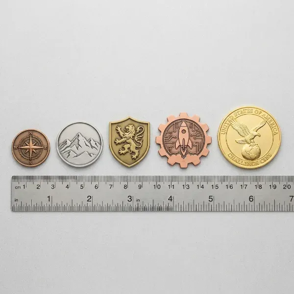
Most custom-made challenge coins in military and corporate settings run between 1.5 and 2.0 inches in diameter. That range gives you enough canvas for a strong design without becoming bulky. If your design is text-heavy, lean toward 2.0 inches, small text on small metal rarely improves after striking.
Shape is where some buyers get creative. A custom silhouette can sharpen recognition for a mascot, department badge, or landmark. The tradeoff is structural risk. Thin protrusions can bend or plate inconsistently, so any custom shape should preserve durable metal bridges throughout.
Obverse and Reverse
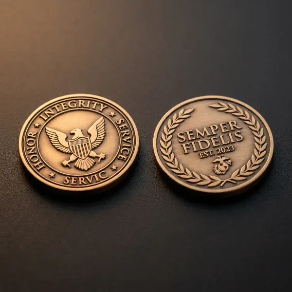
Assign a clear role to each side before placing art. The obverse should carry the primary identity, your logo, seal, or insignia. The reverse handles supporting content: achievement text, a motto, dates, or a secondary emblem. A coin that tries to do everything on both sides usually ends up doing nothing well.
Think of the two sides as a sequence. Front says who. Back says what or why. That structure makes the coin read as intentional rather than crowded.
Artwork, Relief, and Color
2D Design vs. 3D Design
Clean 2D design delivers crisp symbols and typography. 3D design, sometimes called 3D sculpting, adds depth and realism to a hero element like an eagle, helmet, or landmark. Most effective coins use a hybrid: one dominant 3D element surrounded by flatter 2D text and detail work.
When producing unique coins with 3D depth, it should be reserved for specific pieces, not spread everywhere. If everything is raised, nothing reads as important. Negative space is not dead space in metal art, it gives the hero element room to breathe and remain readable under uneven lighting.
Enamel Color Fill
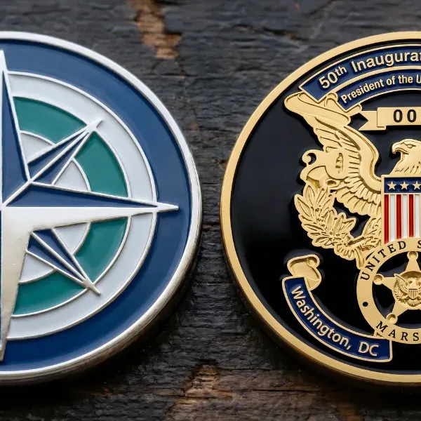
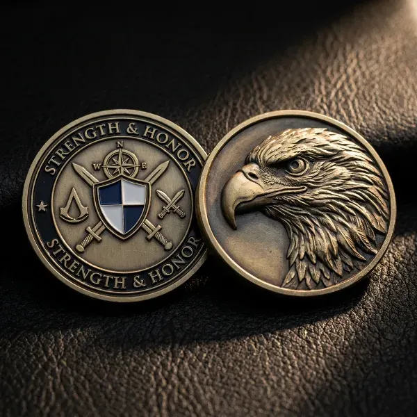
Color is a strategic choice, not a default upgrade. Soft enamel sits below the metal lines and has a slightly textured feel. Hard enamel is filled flush and polished smooth. Both work well, but hard enamel tends to feel more premium in hand.
Limiting your palette keeps the result crisp. A coin with six colors often looks busier than one with two. You can also add specialty fills like glow enamel, translucent enamel, or epoxy dome, but each should earn its place through function, not novelty.
Manufacturability: What Actually Survives in Metal
Minimum line thickness matters. Lines that look sharp on a screen can disappear in struck metal. Tiny enclosed color areas, shallow relief, and dense text that reads fine in a mockup will often fail once the die line becomes tooling. If a design is hard to read when small on-screen, it will be worse in metal.
Finishes, Edge Styles, and Special Features
Plating Options
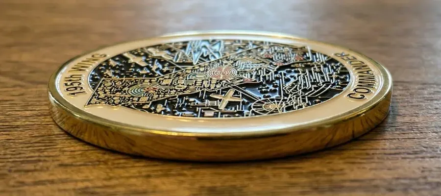
Finish changes the emotional tone of a coin immediately. Gold plating feels warm and ceremonial. Silver plating is cleaner and more modern. Black nickel increases contrast and is a strong choice for tactical or contemporary designs. Antique finish, where recessed areas darken and raised areas catch the light, improves readability because it separates details naturally. That’s why it’s the most forgiving option for complex artwork.
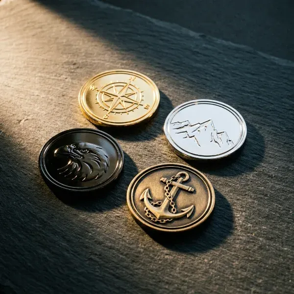
High-polish finishes can look stunning in photos, especially for corporate and event pieces, but they reduce contrast if the relief isn’t strong. That contrast matters with custom police challenge coins, where badges, department seals, rank details, and small lettering must remain easy to recognize. Dual plating combines two finishes on the same coin and can create real visual impact when used with intention.
Edge Styles
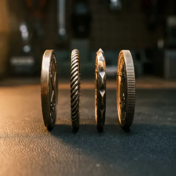
Edge style deserves attention early. Standard edge is clean and simple. Rope edge and spur edge add visual tradition that many recognition programs and military units specifically prefer. Reeded edge gives a coin a classic coin-like feel. Custom edge text, coordinates, a value statement, sequential numbering, or an anniversary year, adds meaning without stealing space from the face.
Other Features Worth Knowing
Cutouts, offset printing, and dual plating are effective when the concept calls for them. Offset printing is sometimes described as picture-perfect for showcasing detailed artwork. Kitting, packaging a coin with other items, is worth planning for early if the coin is part of a larger program.
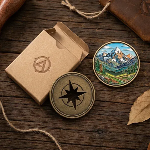
Files, Proofs, and Getting to Approval
Set Your Files Up Right
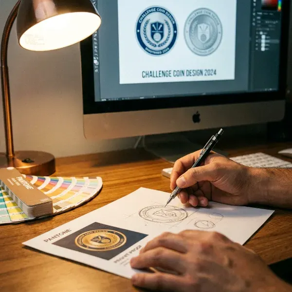
Submit a vector file whenever possible. EPS, SVG, AI, and PDF formats preserve crisp edges and accurate geometry. Low-res images almost always require redraw. Pantone references, approved fonts, and logo usage rules should be documented in one place, small wording changes and color drift are the most common causes of repeated proof cycles.
If you only have a photo or a rough sketch, expect simplification. Gradients, textures, and soft shadows usually need to become solid forms before they manufacture well. That’s not a compromise, it’s part of the engineering process.
Working Through Proof Revisions
The first digital proof is a structural checkpoint, not the finish line. Check layout, text hierarchy, spelling, and visual balance before debating styling preferences.
Make artwork revisions specific. “Increase contrast,” “thicken lines,” and “simplify background” move a project forward. Lock size, plating, edge style, enamel color fill, and 2D or 3D callouts before final proof approval- those specs define what gets built, and ambiguity here is a production risk.
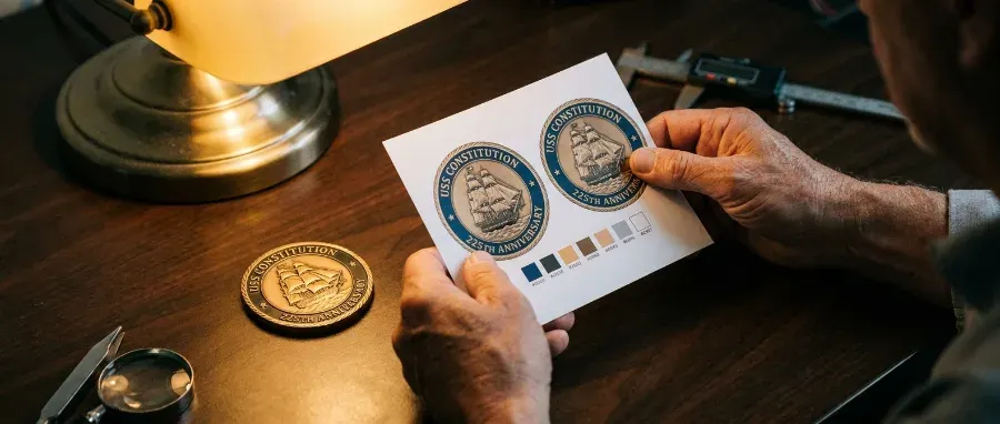
Verify every text element carefully. Motto, dates, acronyms, and unit numbers are the details most likely to survive into production exactly as approved. If you’re part of a team approval process, use one shared proof as the source of truth and assign a single person to consolidate feedback before sign-off.
The Monterey Company has been producing custom challenge coins since 1989, offering free digital proofs, no minimums, and an in-house art team ready to take your concept from a blank canvas to a finished product. Start your order today.

Eric Turney
Eric Turney A devoted father, football fanatic, and stand-up comedy enthusiast who loves nothing more than bringing people together over great food and a good time. When he’s not cheering on his favorite team or experimenting in the kitchen, you can find him connecting with others on LinkedIn

 Coins & Medals
 Corporate Gifting & Events
 Custom Labels & Accessories
 Everything Keychains
 Headwear
 Holidays